SPLATT – Skincare Brand Visual Identity System
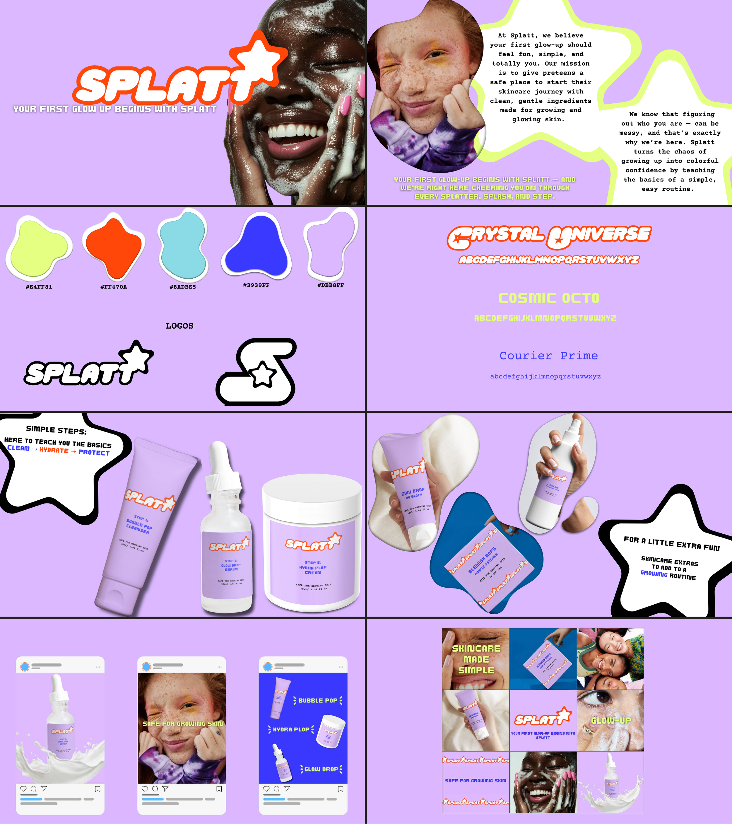
SPLATT is a conceptual skincare brand designed as a safe, playful introduction to skincare for preteen girls navigating their first “glow-up.” The goal was to create a brand identity that feels fun, approachable, and confidence-building while still communicating trust and gentleness.
I developed a complete visual system from the ground up, including logo design, color palette, typography, packaging, product mockups, and social media assets. The soft lavender base paired with bright, “splat”-inspired accent colors creates a youthful, energetic tone, while rounded typography and organic shapes reinforce a friendly, low-pressure feel.
Beyond aesthetics, this project focused on building a cohesive brand experience across every touchpoint — from product labels to Instagram posts — ensuring the identity feels consistent, recognizable, and scalable.
This concept allowed me to practice thinking like a full brand designer, balancing strategy, audience, and visual storytelling rather than designing isolated graphics.
Tools: Illustrator, Canva, mockups, social media layout design